I'm Zack a graphic & motion designer from Wigan.
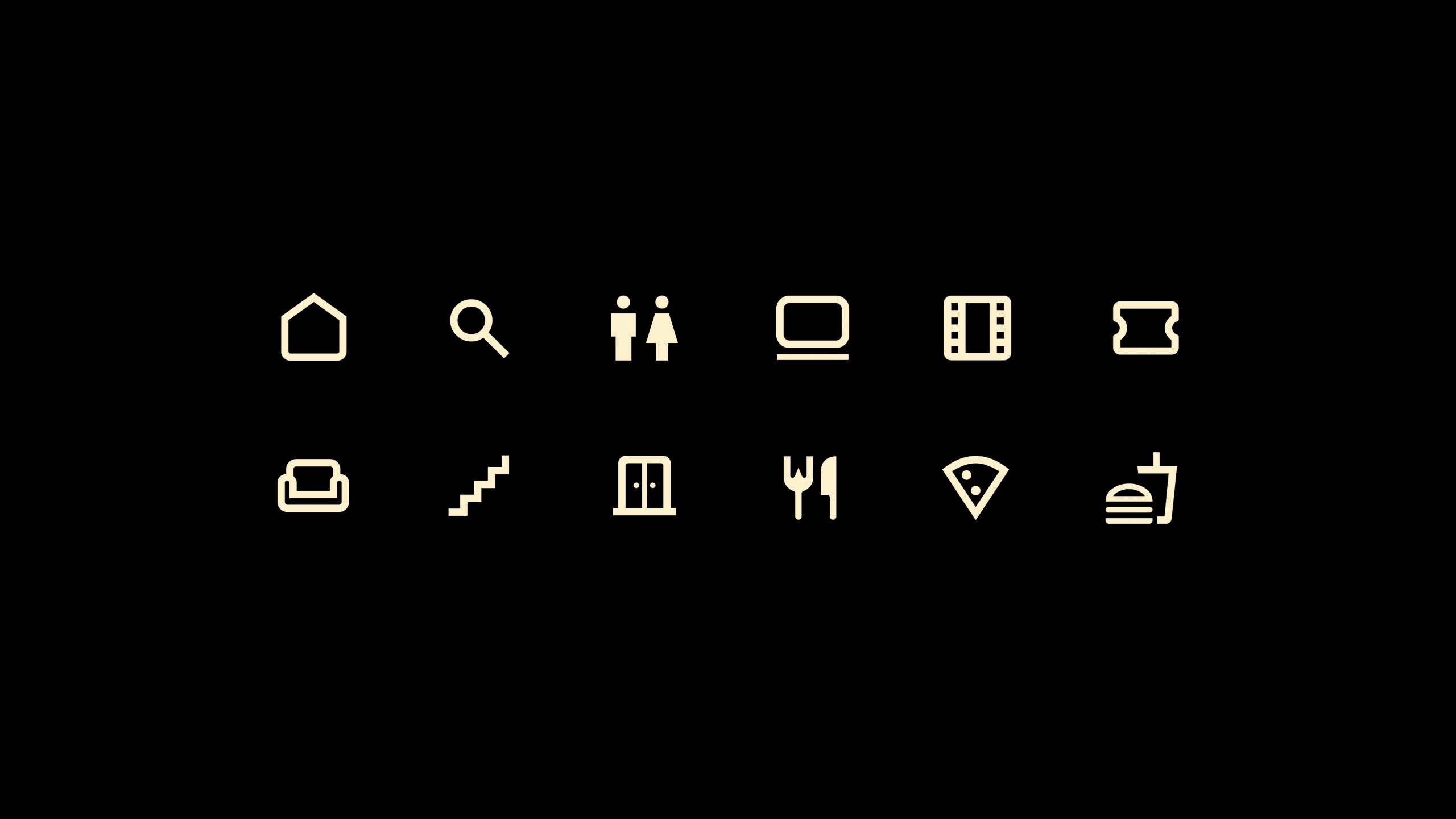
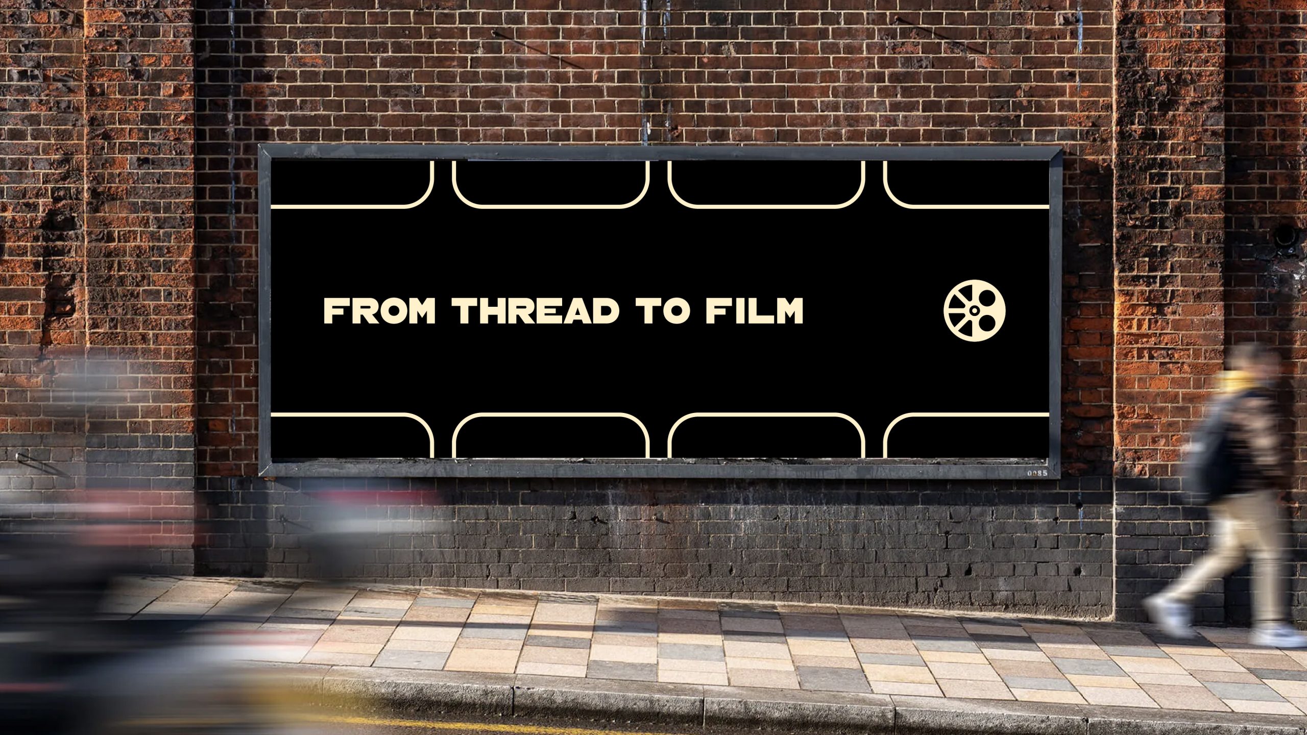

The Reel is a cinema set within the historic Eckersley Mill in Wigan, a space where industrial heritage meets contemporary film culture.
This connection forms the basis of a flexible visual identity, using the idea of winding reels to inform scrolling image systems, layered textures, and rotating graphic elements. The result is a distinctive brand that feels tactile, cinematic, and deeply rooted in its environment.
Self Initiatied
Industry:
Entertainment
Role:
Senior Graphic & Motion Designer

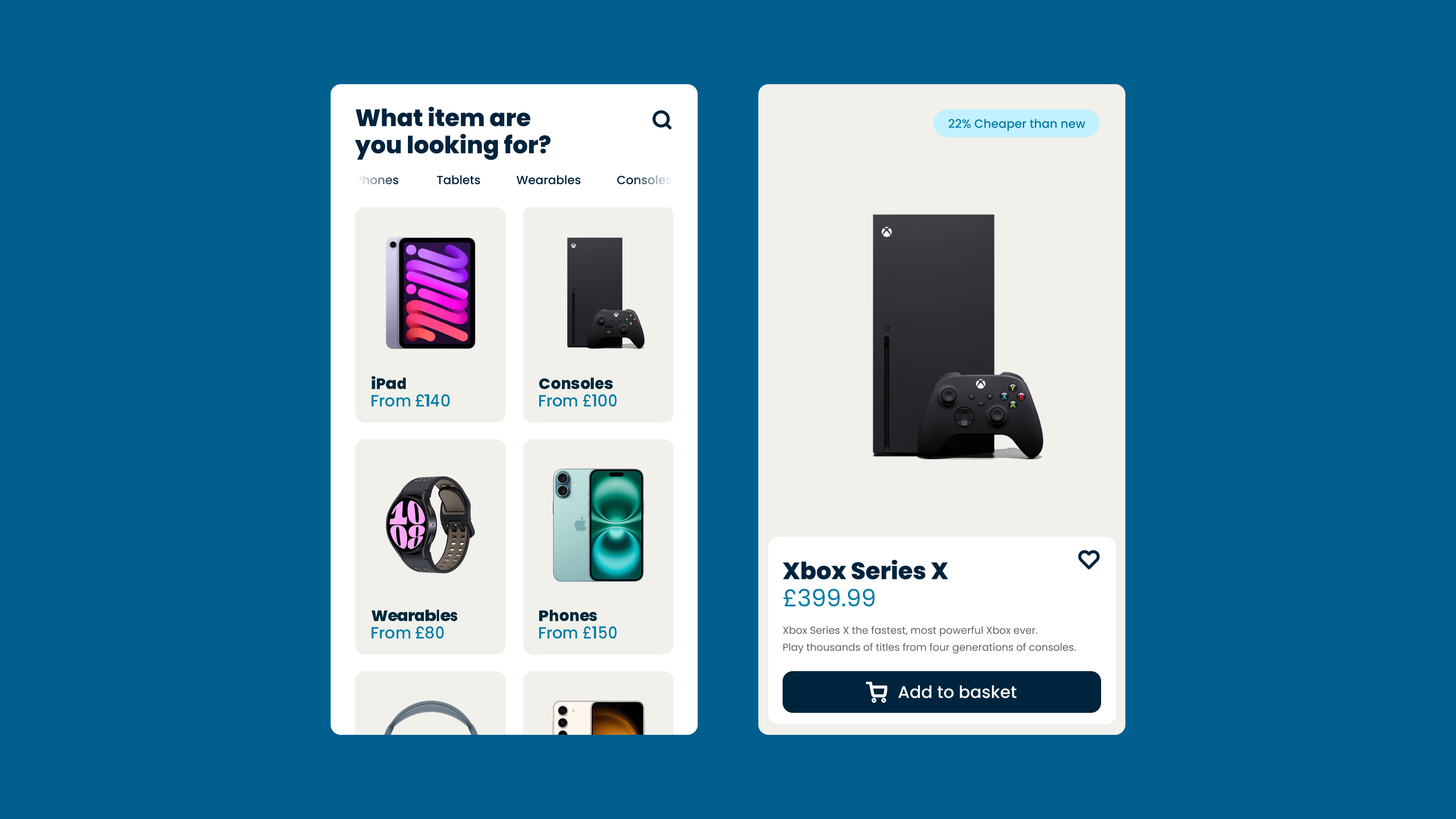
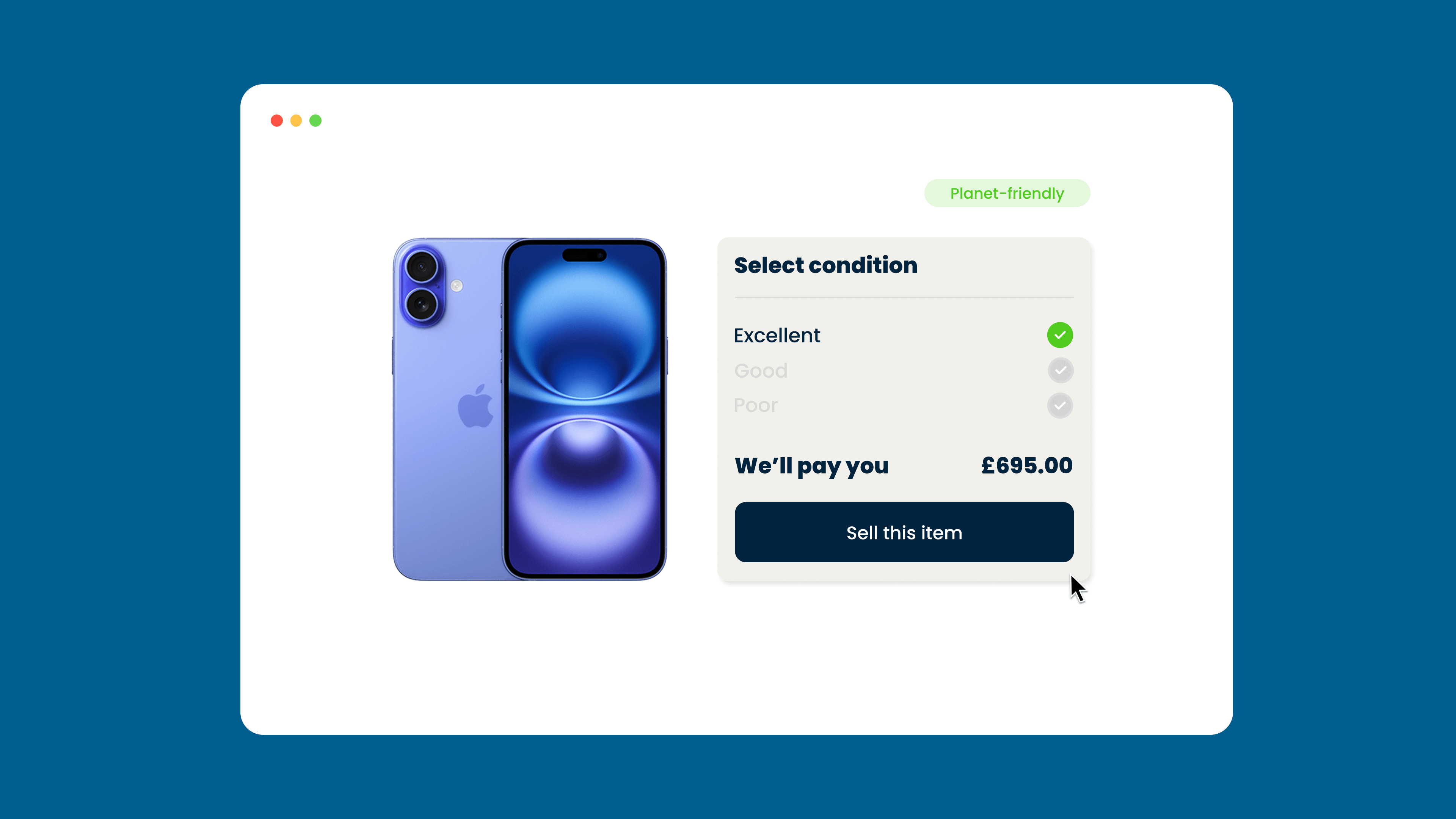
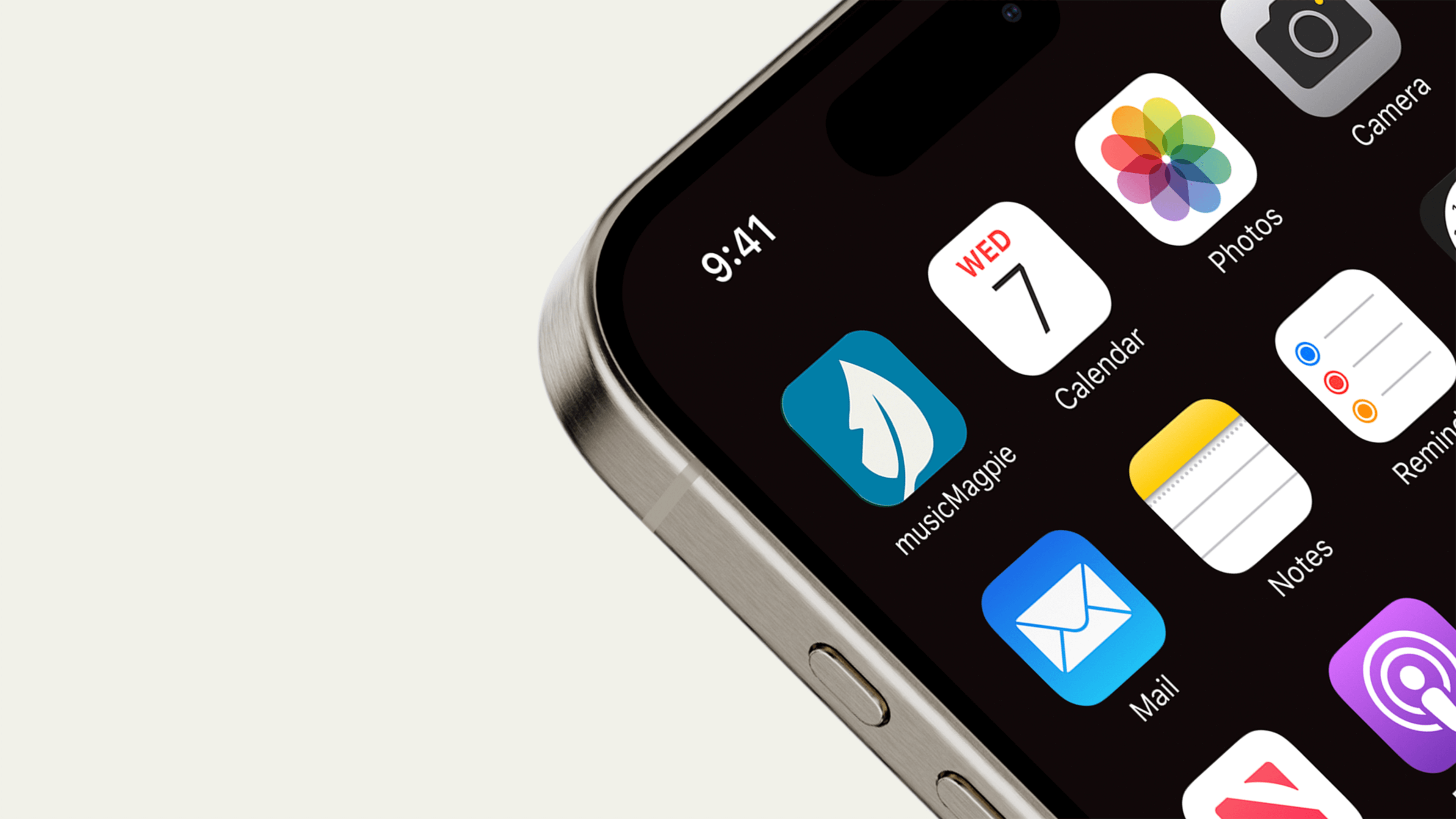
musicMagpie provides a trusted, sustainable platform for buying and selling tech, CDs, DVDs, games, and books. Since 2007, they have helped millions of customers save money, earn cash, and support the circular economy.
As Senior Graphic and Motion Designer, I led and delivered all motion projects, crafting clear, simple, and impactful animations that reflected the brand’s identity.
Our work consistently highlighted the benefits of refurbished tech and media while reinforcing musicMagpie’s dedication to sustainability and affordability.
musicMagpie
Industry:
Refurbished Tech
Role:
Senior Graphic & Motion Designer
WN35 Music is a podcast that dives into the latest stories from the world of music, with a special focus on the indie rock scene. It features lively discussions, fun segments, and exclusive interviews.
Freelance
Industry:
Media & Entertainment
Role:
Graphic Designer
Refurbished Rebellion was a record-breaking campaign that challenged the norm by proving customers don’t need to buy new or overpay for tech.
musicMagpie
Industry:
Refurbished Tech
Role:
Graphic & Motion Designer
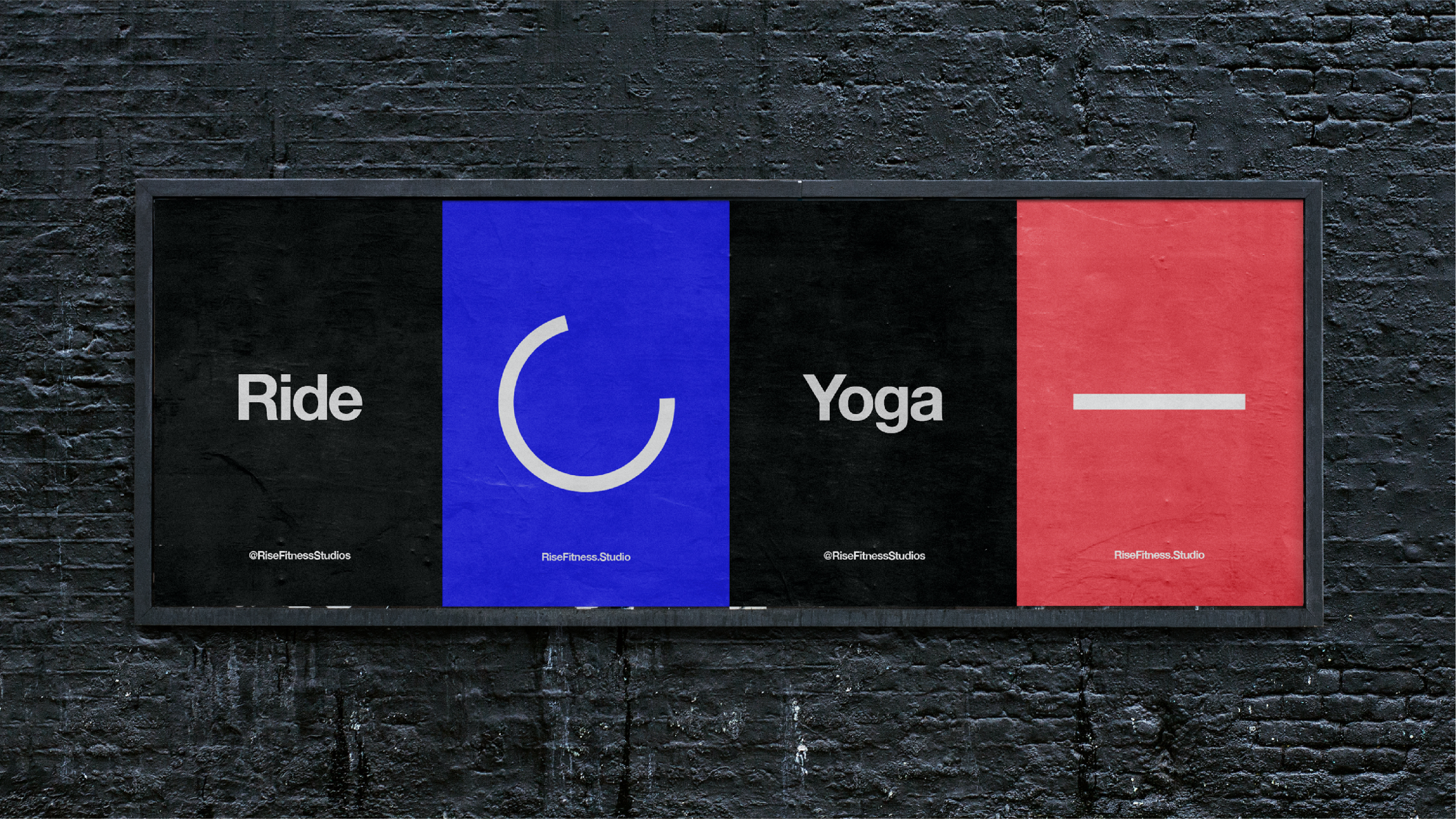
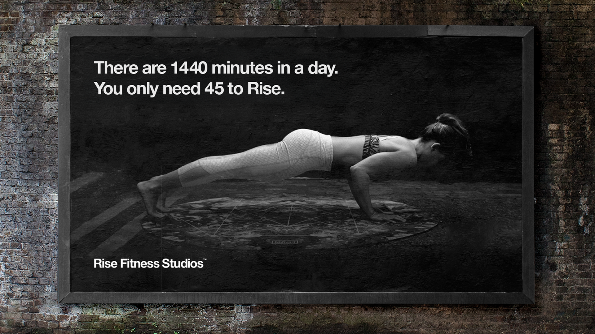
Rise Fitness Studios was founded in 2016 with the goal of transforming the fitness scene in Liverpool, helping people become healthier both mentally and physically while having fun.
Stride
Industry:
Health & Fitness
Role:
Graphic Designer
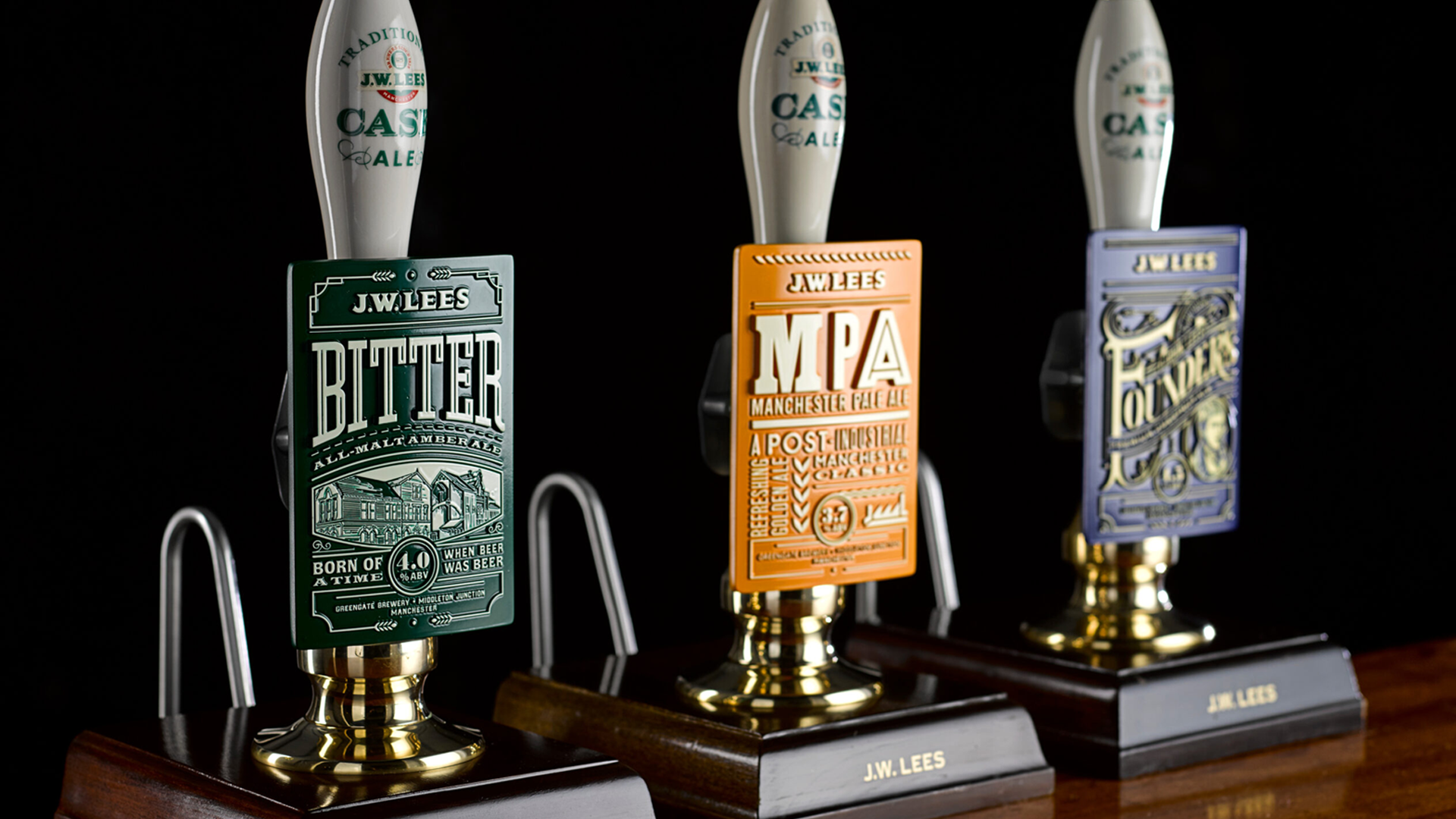
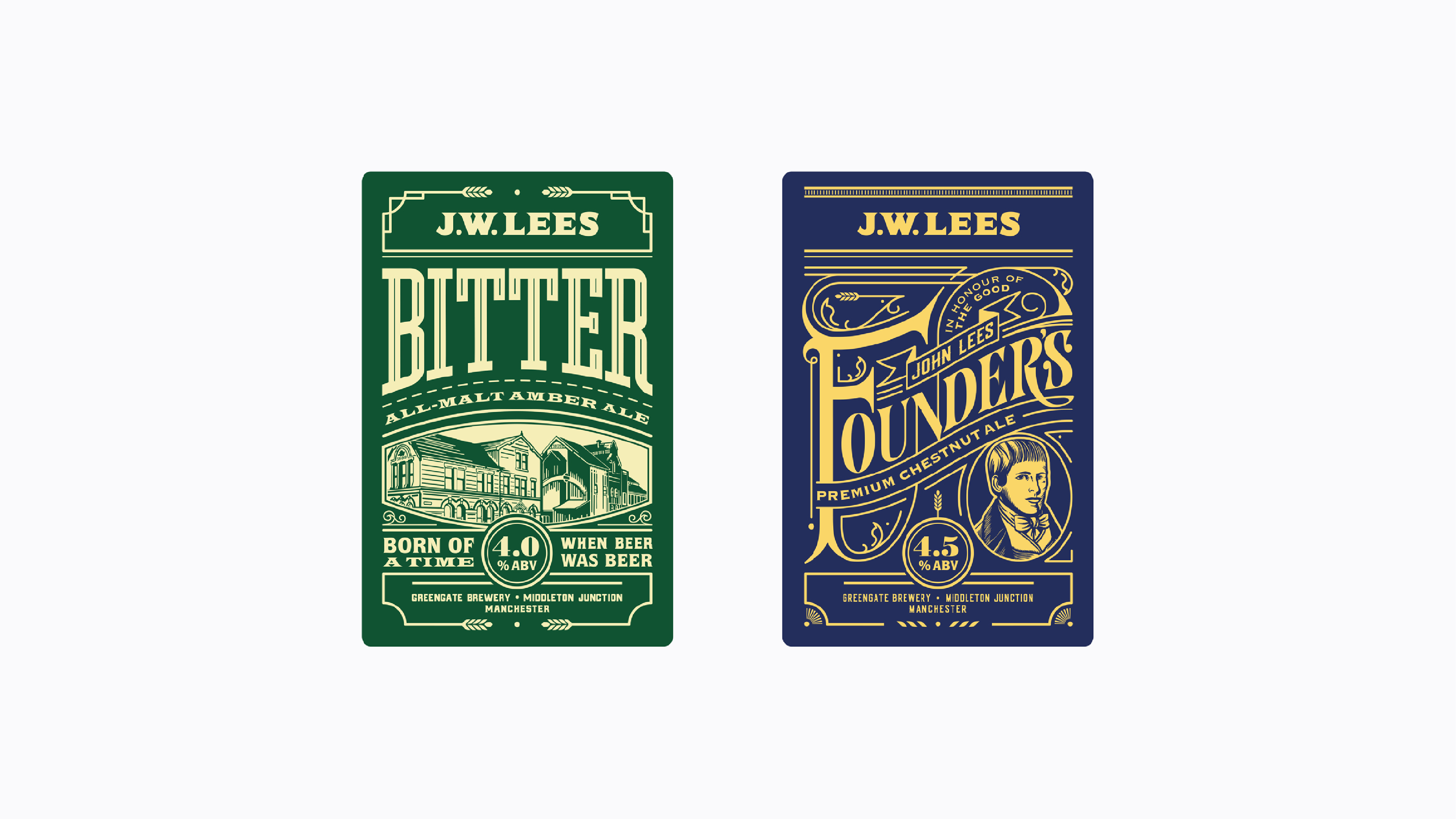
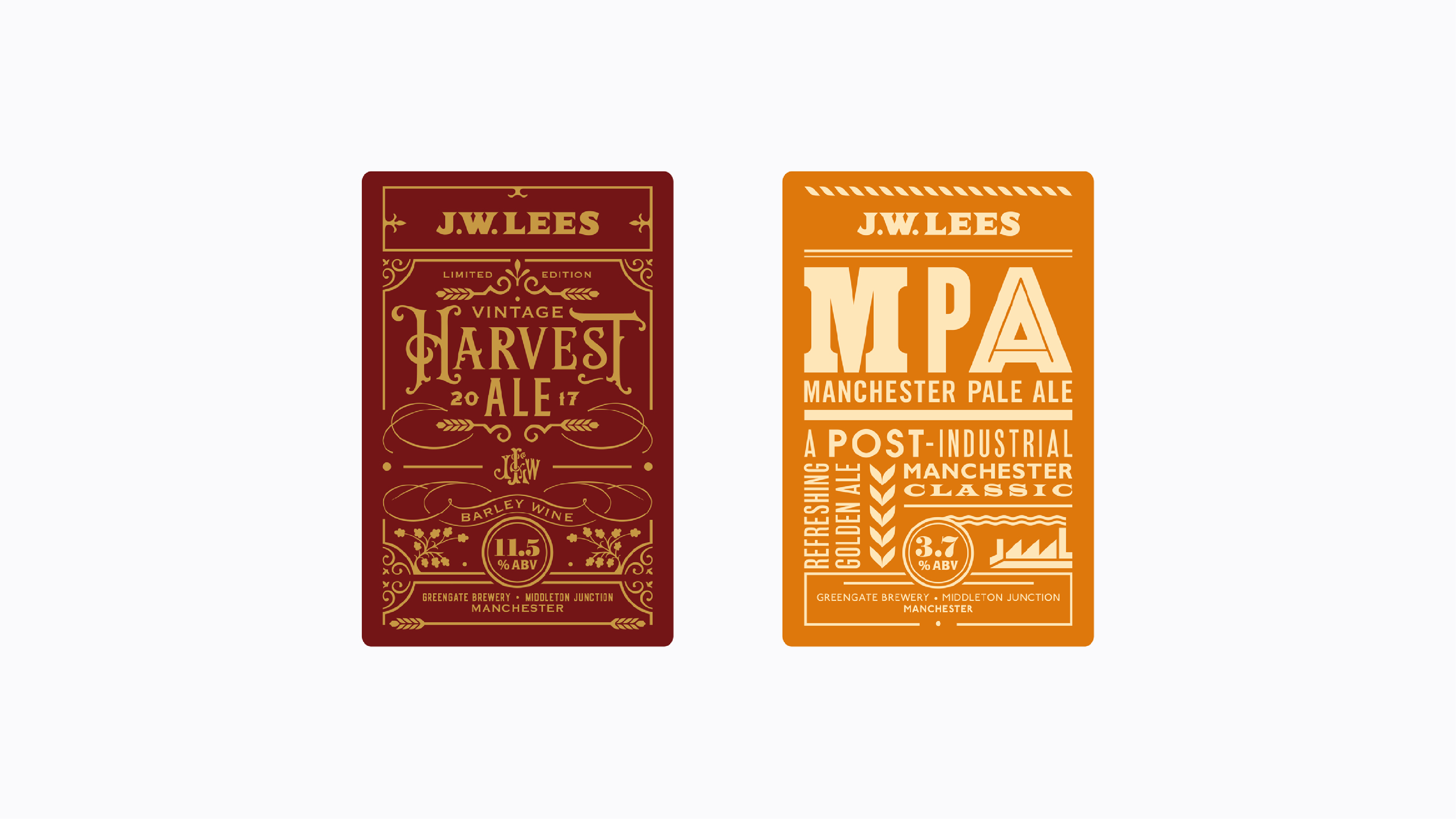
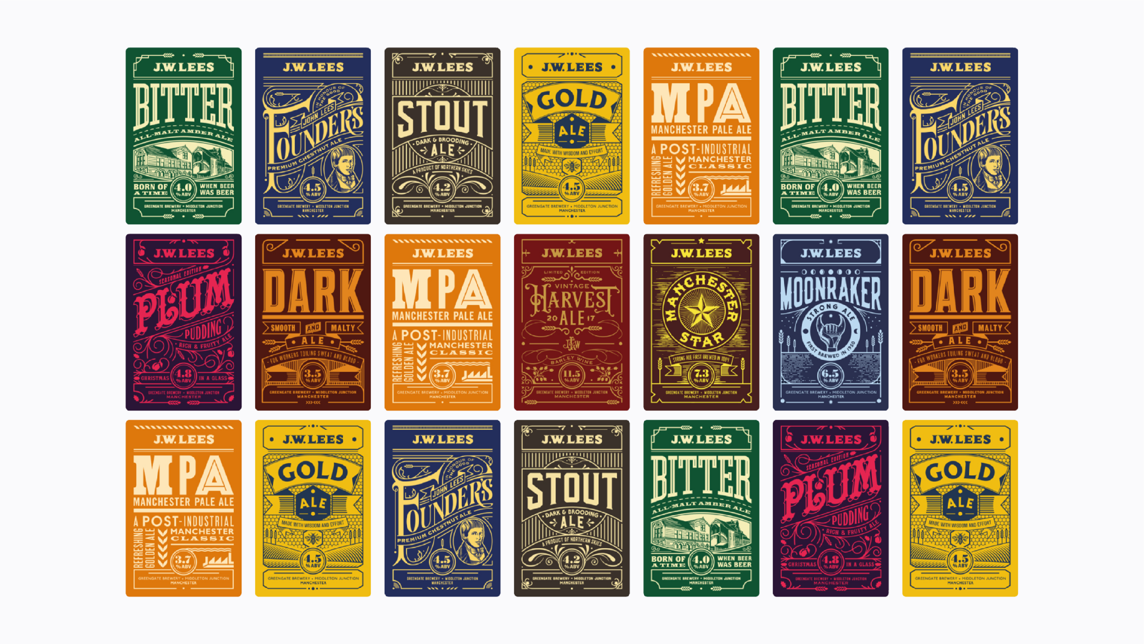
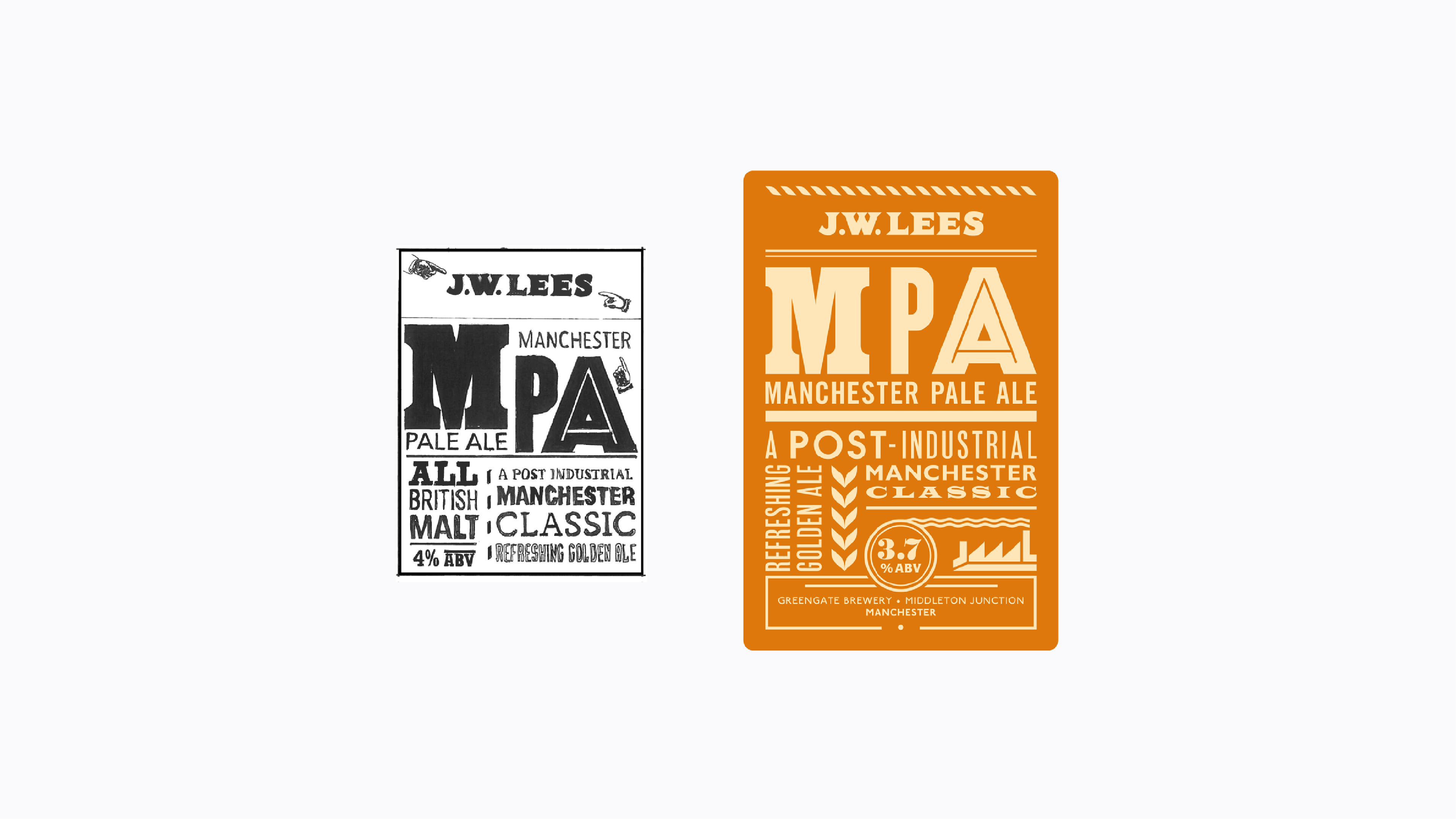
JW Lees is a historic, family-owned brewery established in 1828, based in Middleton, Greater Manchester. Renowned for its heritage and commitment to quality, JW Lees produces a diverse range of traditional ales, seasonal beers, and innovative brews.
Squad
Industry:
Hospitality
Role:
Graphic Designer

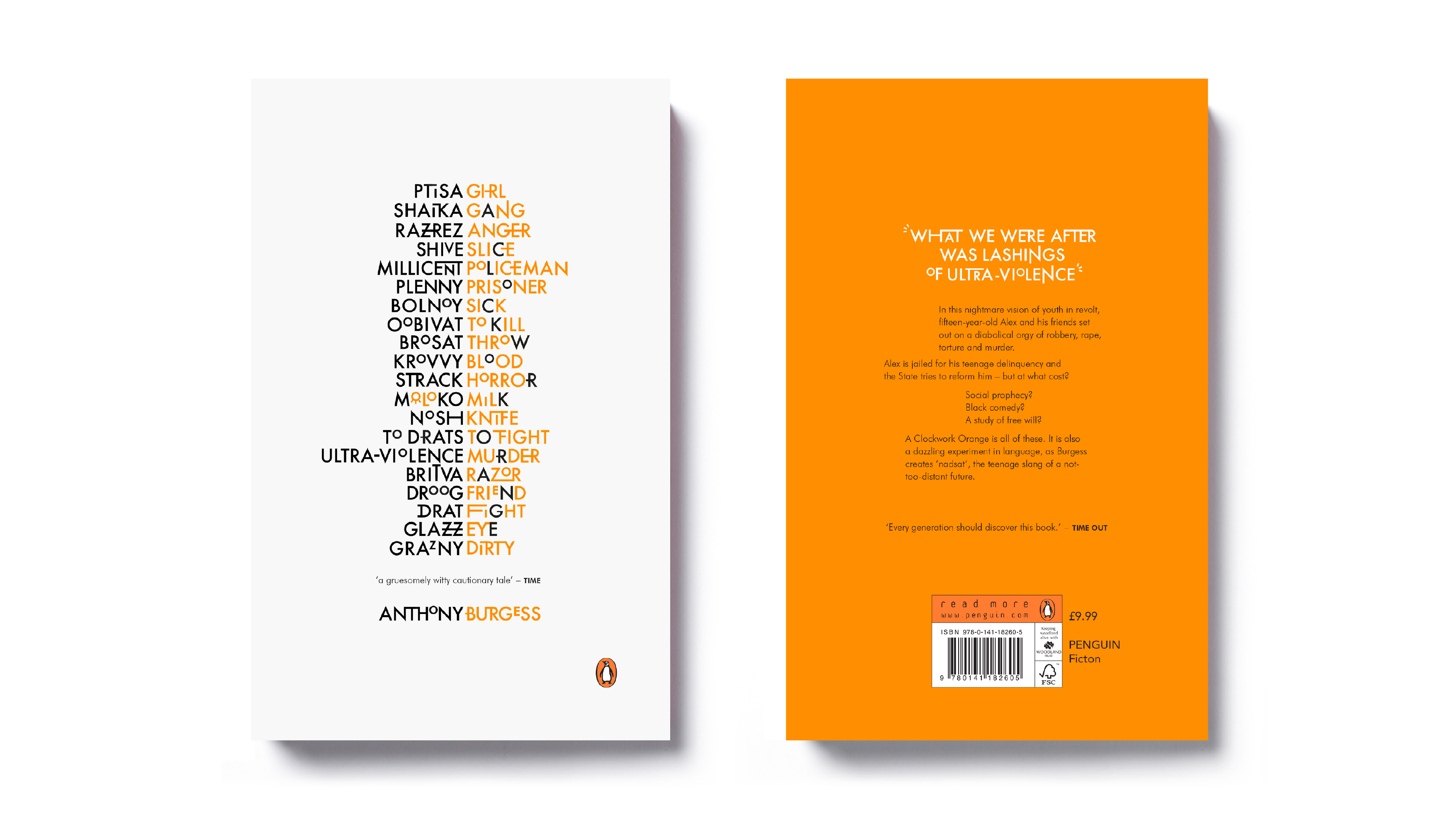
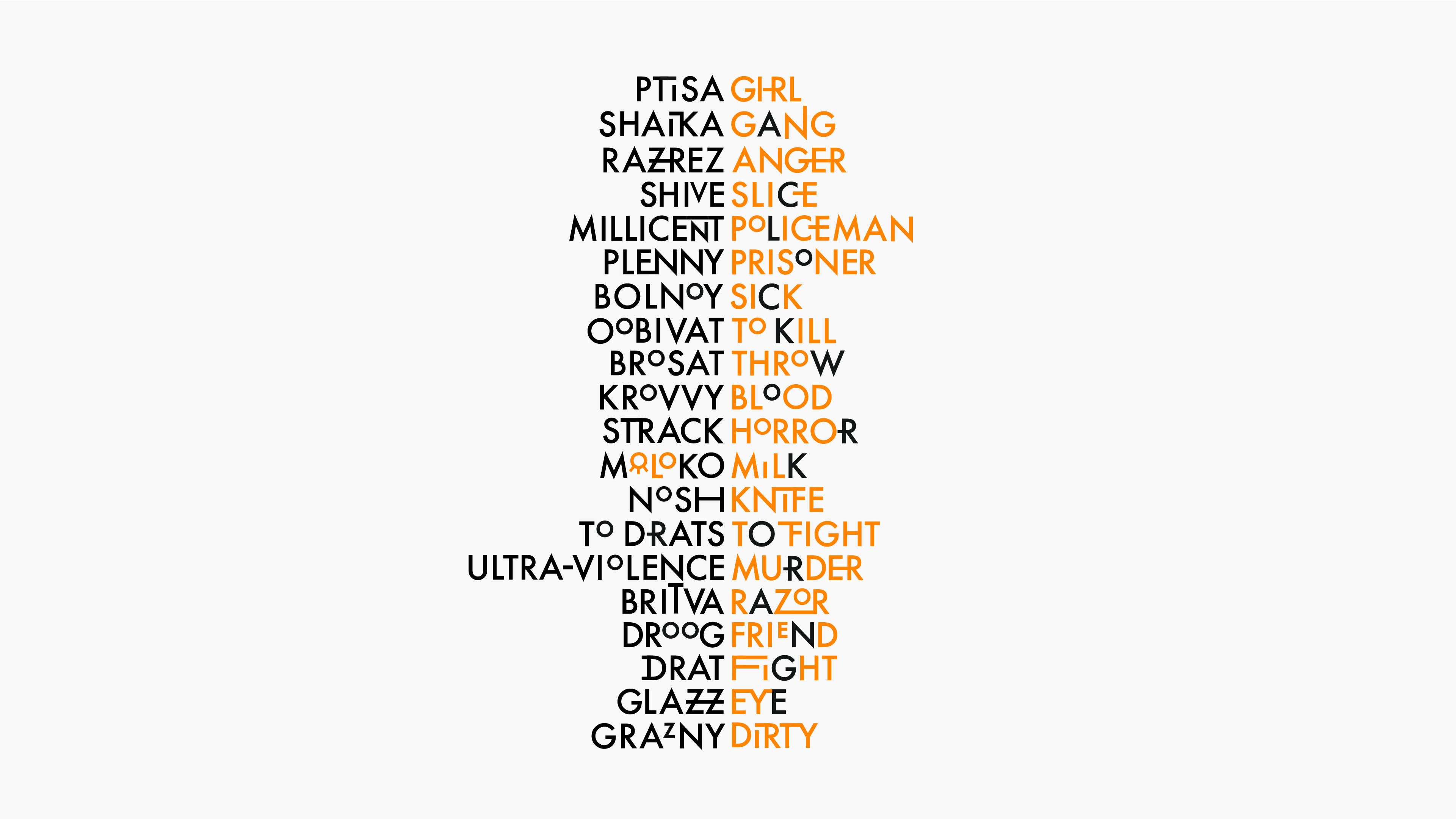
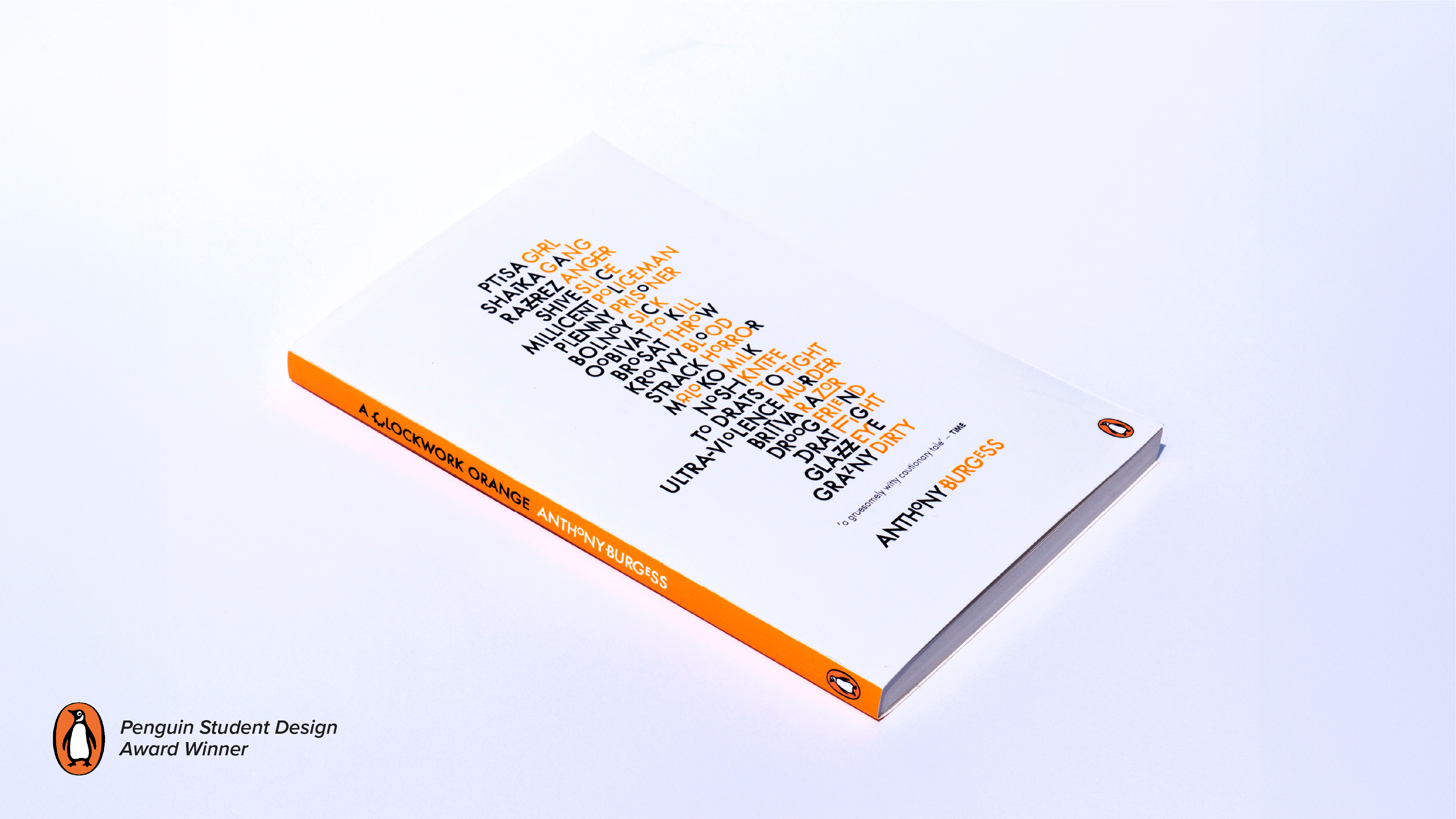
A Clockwork Orange cover design and winner of the Penguin Student Design Award.
Penguin Random House
Industry:
Publishing
Role:
Student
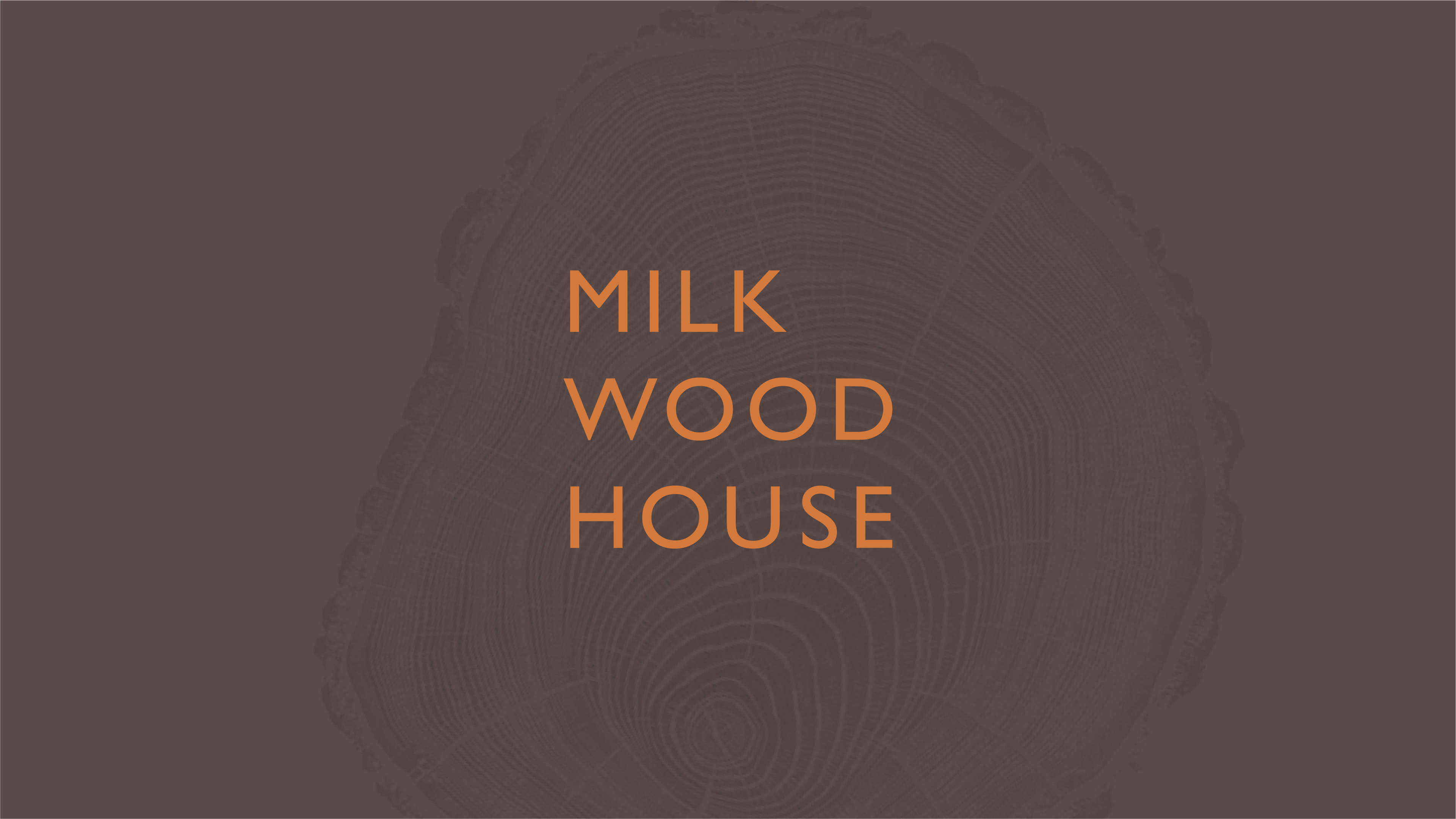
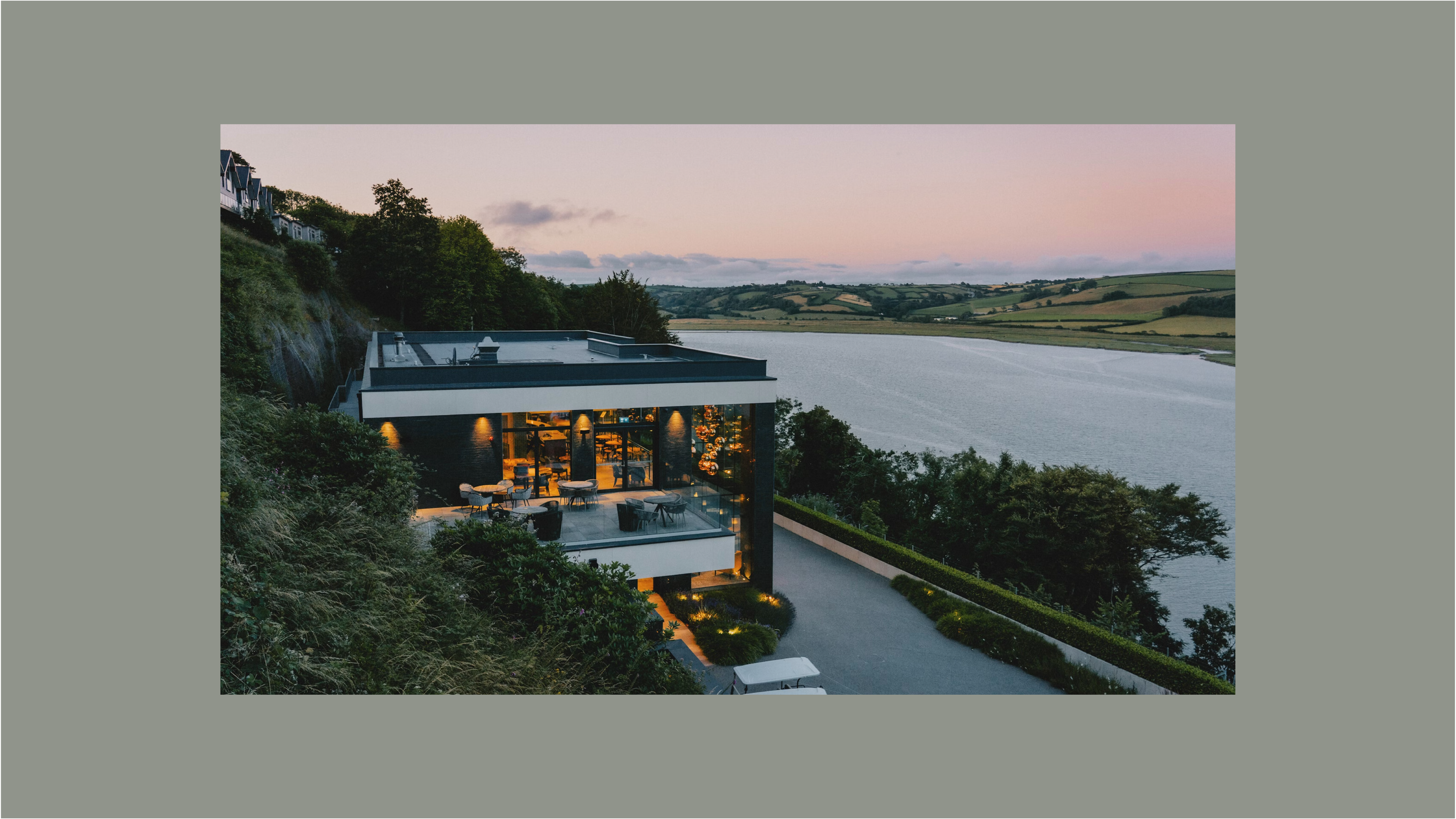
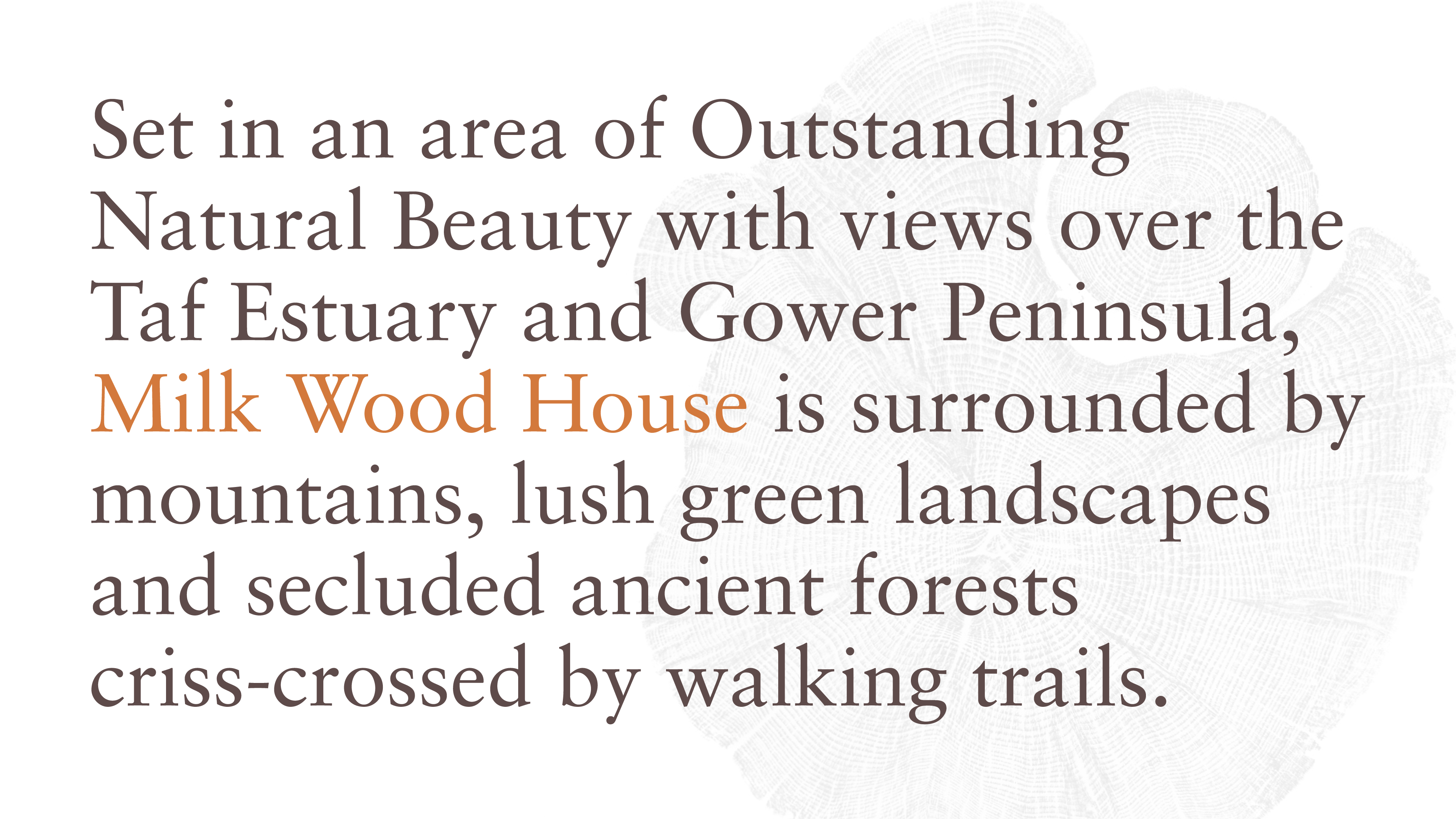
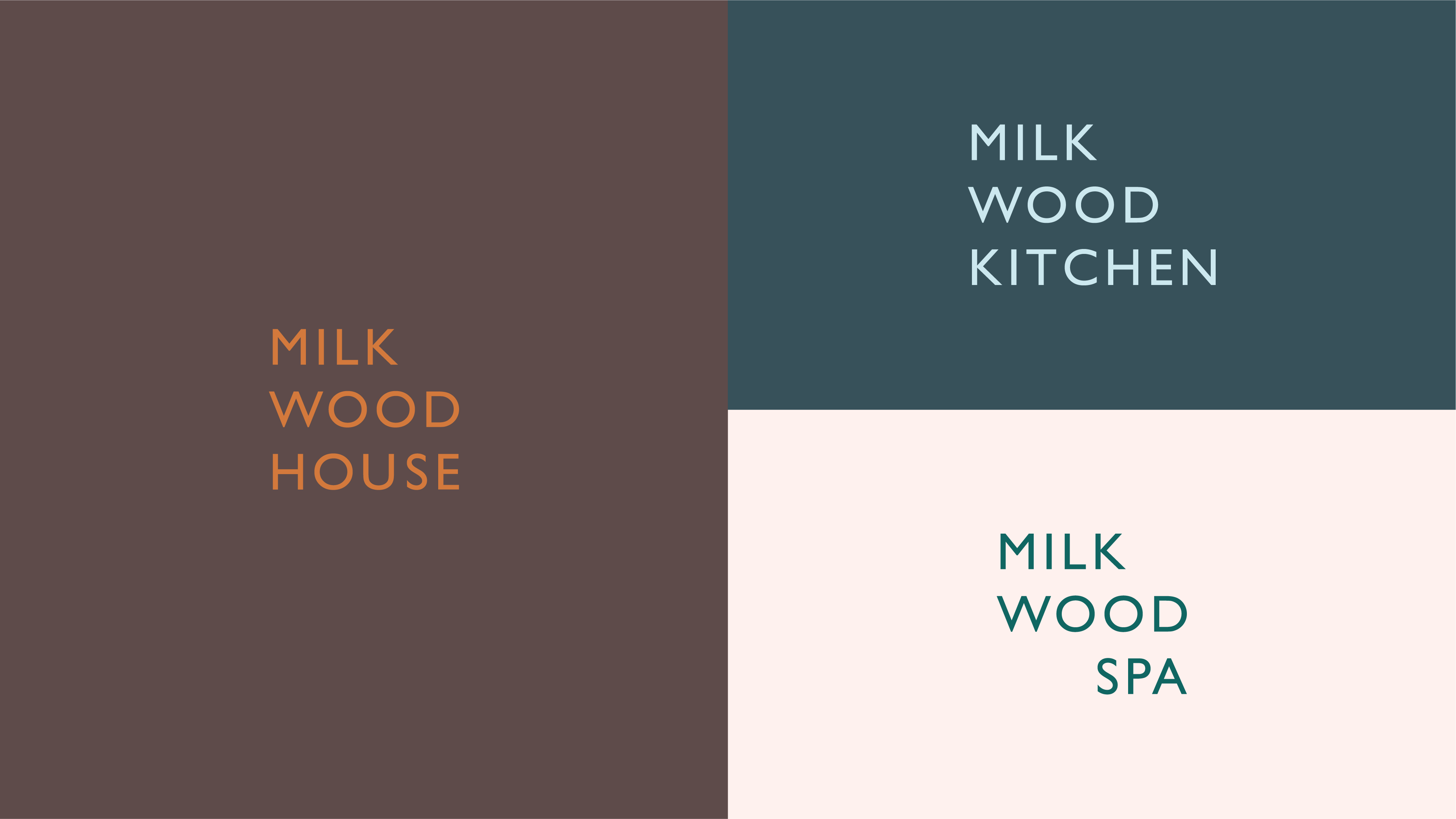

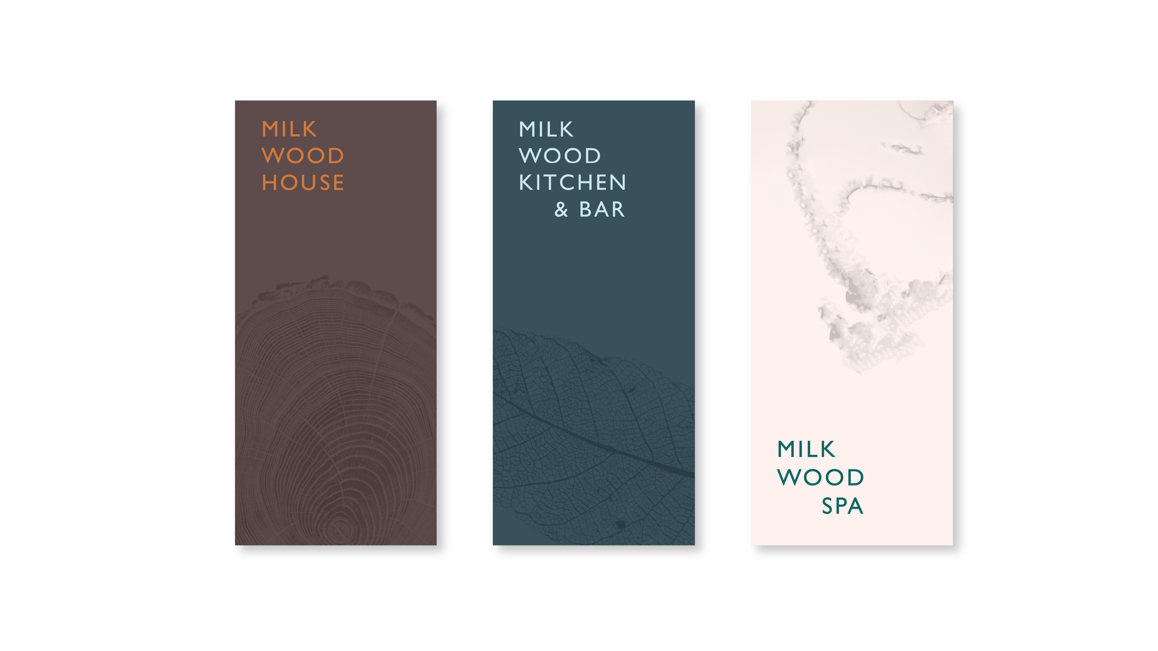
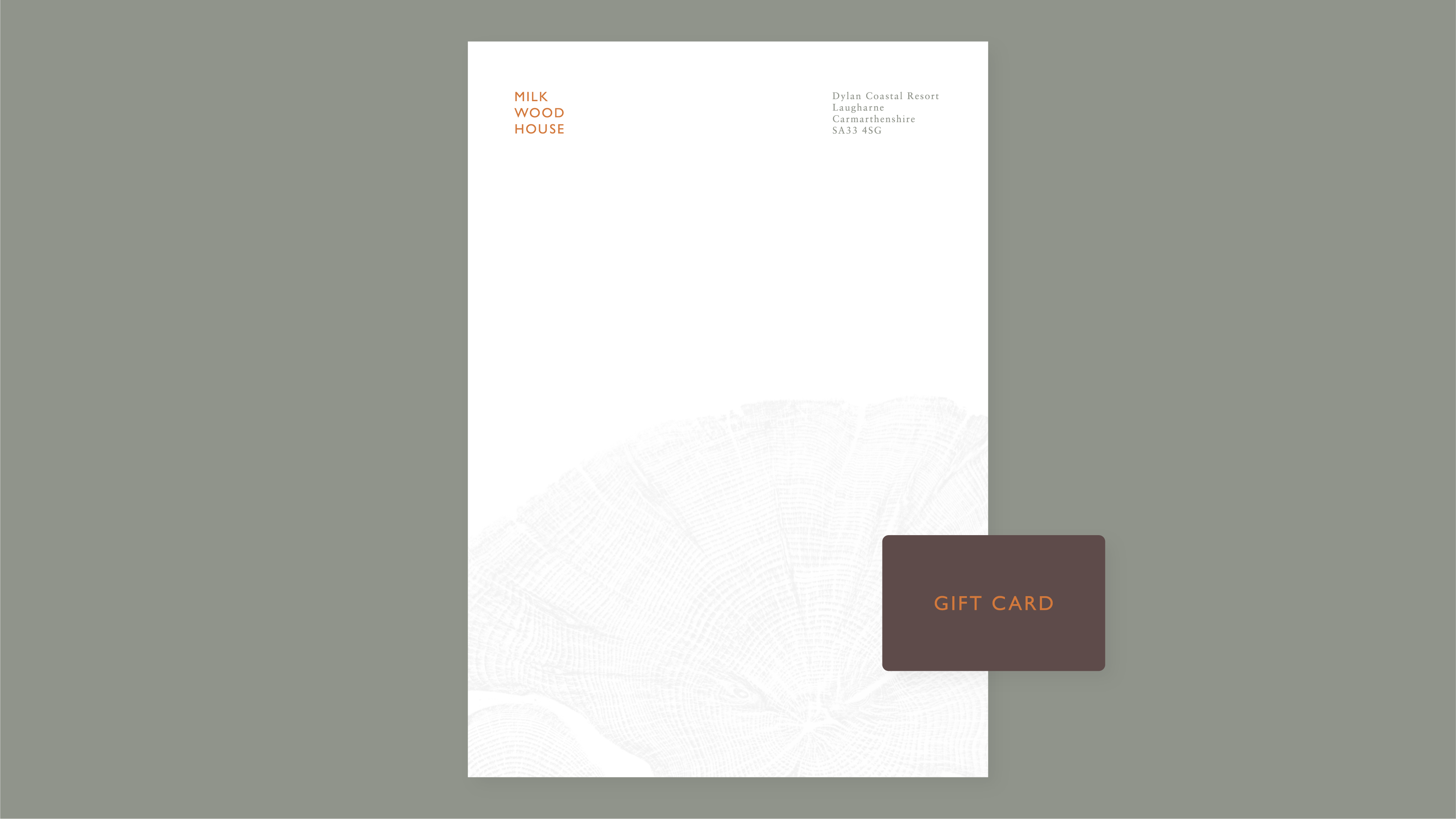
Milk Wood House is a spa nestled in an Area of Outstanding Natural Beauty. Surrounded by mountains, lush landscapes, and secluded forests, it offers a serene escape that seamlessly blends with nature, inviting a deep connection to the tranquil environment.
Stride
Industry:
Wellness & Hospitality
Role:
Graphic Designer